Ancestry Composition Report
23andme
Overview
The genetics of ancestry is a rapidly growing marketing. Every year, millions of people purchase a genetic ancestry service to learn what their genes can tell them about where they came from Ancestry Composition is powerful tool that provides our users this information. The user would see a percentage breakdown by geographical region. The ancestry composition design has since become an iconic and sharable party of 23andMe. It celebrates diversity and has the opportunity to bring the world closer together.
Ancestry Composition Chart - A Personal Portrait
23andMe has led the science in genetic ancestry since early in the company's history. But, 23andMe first and foremost is a genetic company, and genetic must be the core of the report. Working closely with genetic genealogists and data scientists, we honed in one core concepts that we could report with a high degree of scientific certainty: the personal portrait. Since launch, the personal portrait is our most popular ancestry tool on social media. Because the product is able to breakdown a user's genetics into as many as 31 different populations, we used a wide spectrum of brand's colors and assigned them to 31 tested populations. Our goal is to make users feel delighted with how colorful their genetics and ancestry can be!
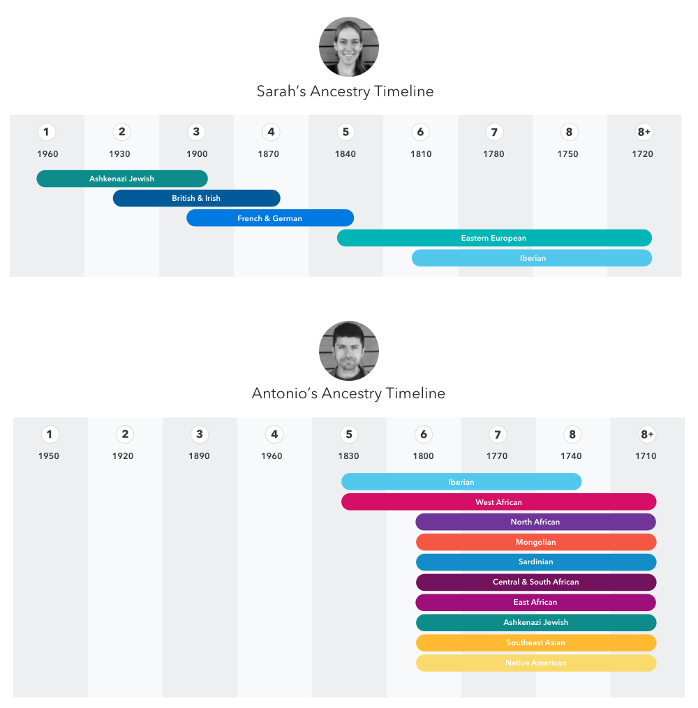
Ancestry Timelines
Ancestry Timelines allow our customers to go back in time and learn approximately when a particular ancestry entered their family tree. The Ancestry Timeline was made possible through pioneering work by 23andMe Research Scientist Kasia Bryc, whose previous research provided insights into the American melting pot.
23andMe determines your Ancestry Timeline by analyzing the pattern of ancestry in your genome. It looks at both the number and size of segments that derive from a particular ancestry as well as their distribution across your chromosomes. Large segments of ancestry in your genome that all come from the same population suggest a recent ancestor, while shorter segments suggest a more distant one.
Early design concepts focused on defining the best visualization for the concept. After user testing, we realized the design need to be simplified and focused on main takeaway for this feature which is about your ancestor. I created numerous variations to represent an individuals ancestry.
Below are two final designs
What's next?
While the database is growing, we are getting ready to provide user with more ancestry populations for user. I'm working on the next generation of ancestry features.
If you are interested in a live ancestry composition report, here is my ancestry report.


